Our grid system is elegant in its sheer simplicity of use. By defining the grid based on simplicity, space and balance, the system stays flexible but ensures a consistent look and feel across communication materials.
SIMPLICITY
Our compositions are simple and straightforward - represented in a classic no fuss design.
SPACE
Like our surroundings, we allow space for all elements to breathe.
BALANCE
A symmetrical grid with central alignment reflects our focus on the individual and giving them a well rounded and balanced education.
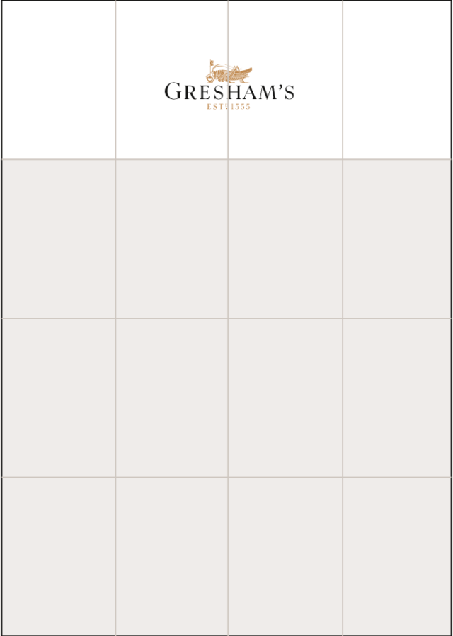
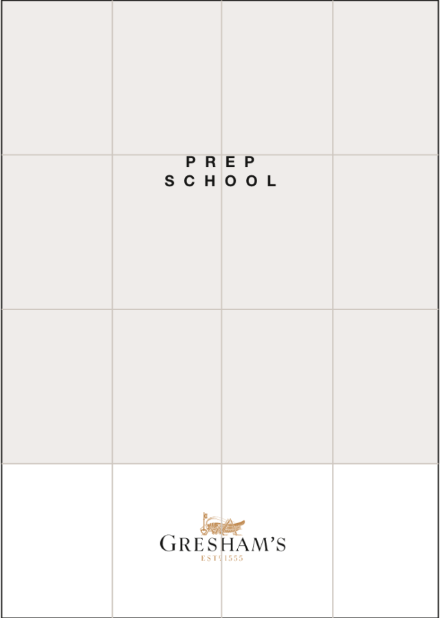
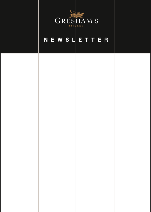
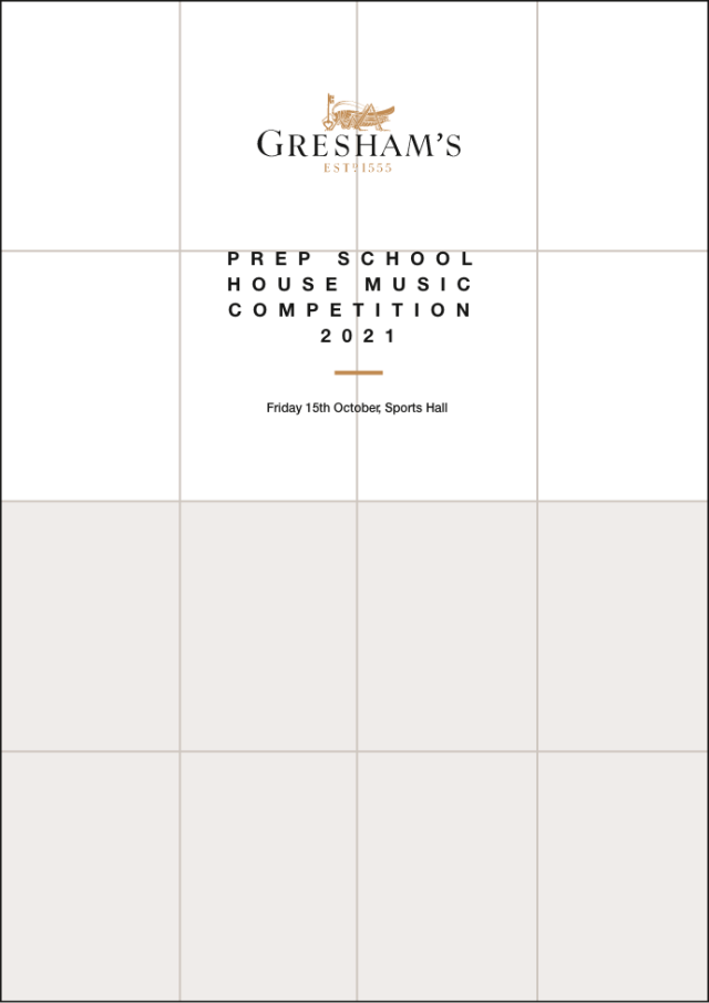
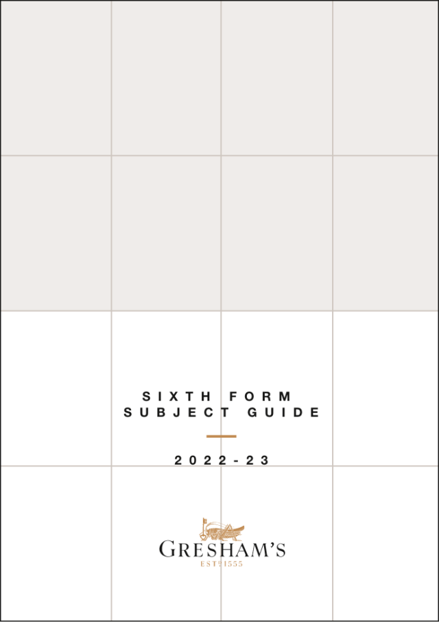
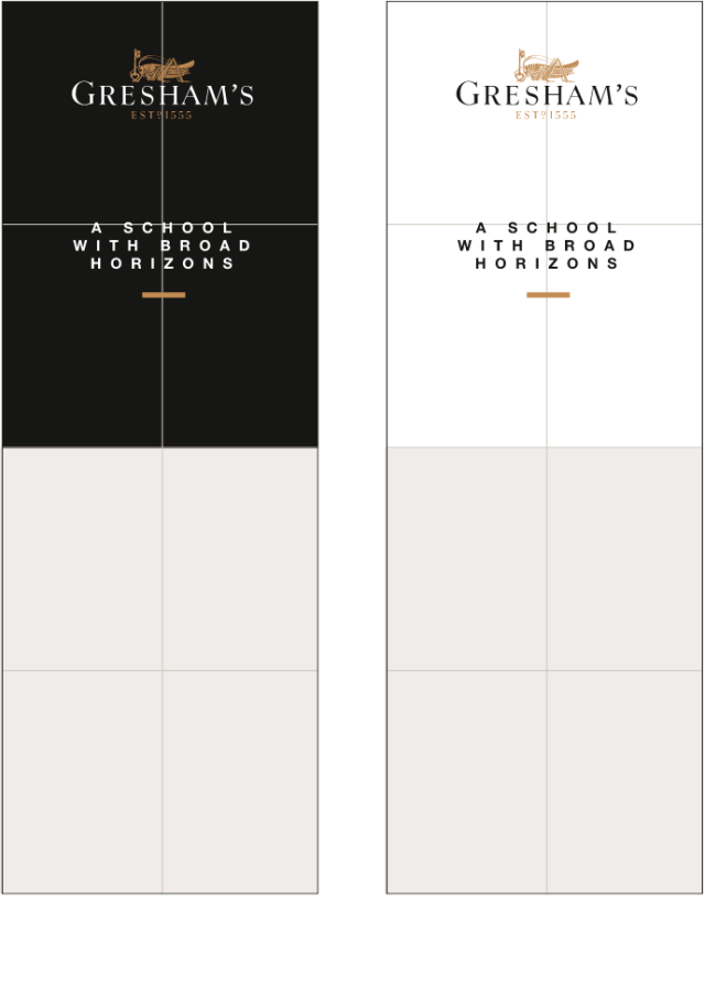
COVER GRIDS
Using a system of 1/4s, 1/2s and 3/4, we can place imagery and text within the grid.
CONTENT GRIDS
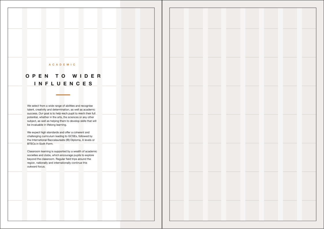
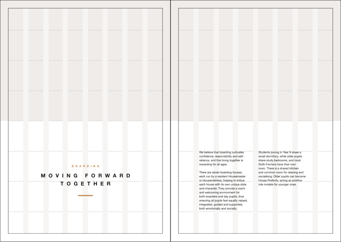
Work to an 8 column grid, with equal gutters and margins. This A4 example has gutters of 6mm and margins of 10mm. Headings can break the grid if needed and use the vertical grid to help the composition of image and text. Ensure there is variation throughout a document so seek professional advice if needed.
-
HOW TO APPLY OUR IDENTITY
Here are some examples of how the elements of our brand identity come together to create a feel that is uniquely Gresham’s.
-
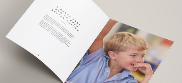
DOWNLOAD RESOURCES
Download our logos and templates which have been created for marketing materials. New artwork needs to be approved by marketing@greshams.com.